-
If you are posting pictures, and they aren't posting in the correct orientation, please flush your browser cache and try again.
Edge
Safari/iOS
Chrome
You are using an out of date browser. It may not display this or other websites correctly.
You should upgrade or use an alternative browser.
You should upgrade or use an alternative browser.
New site design - issues and opportunities
- Thread starter John-W-WI
- Start date
John-W-WI
Administrator
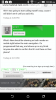
The first tweak I found was on the mobile login screen. On the desktop the picture of the lock and the text boxes are side by side. On the mobile version they are overlapped and difficult to see what is going on. See the following picture.

The second one I found is at the bottom of the page while reading a thread. The "Previous 1 2 3 Next" gets slightly covered up by the "home->forums->general section". Looks to need slightly more vertical space. As it is, it's difficult to jump from page to page as they are slightly covered up. See the following picture:
I'll keep playing around and report anything I find here.
Thanks,
-John
Attachments

SmallChunk
5 year old buck +
This is kind of hard to explain, but I shall try my best. I like to always "mark forums read" before I leave the site so I can see what is new when I come back. When I come back to the site, I like to click on "fruit trees" for example and see what is new there. The links that have new posts show up in bold (which I really like). Now what I was wondering was can this part be changed....when I click on the link, I would really like for the page to come up to the last posting prior to my last time viewing the link. Right now, it will sometimes do that and other times it throws me back to a couple of days prior and I have to scroll down to the new posting. I am wondering if the posting of pictures in a link is the reason? Does this make sense? It isn't a huge problem, just something that would be handy! Also if this matters, I am usually on my ipad.
bueller
Moderator
SmallChunk, I experience the same thing and I believe it is when an old thread gets a new post that we are not taken directly to the new/first unread post.
I never use those red arrows. I just click on a thread that is in bold meaning there are posts in that thread I haven't read yet. 99% of the time clicking on the bold takes me right to the new and unread posts, except when as described above. This feature alone makes this forum more enjoyable to read and post on than most others.
I never use those red arrows. I just click on a thread that is in bold meaning there are posts in that thread I haven't read yet. 99% of the time clicking on the bold takes me right to the new and unread posts, except when as described above. This feature alone makes this forum more enjoyable to read and post on than most others.
leexrayshady
5 year old buck +
The what's new didn't show up on mobile version
bueller
Moderator
Turn your phone/tablet sidewaysThe what's new didn't show up on mobile version
Hi everyone, thanks for all of the helpful screenshots and input! I wish I had a whole community to test all of my projects!
Just wanted to let everyone know that I will be going out of town in a few hours until Sunday evening, but will be back to work on this stuff and will complete everything very quickly next week!
Just wanted to let everyone know that I will be going out of town in a few hours until Sunday evening, but will be back to work on this stuff and will complete everything very quickly next week!
wiscwhip
5 year old buck +
HEY! We want results not promises! Just kidding Patrick, you are doing a great job so far and being very attentive to the needs of the forum and it's members. Thanks! Enjoy your time away this weekend!Hi everyone, thanks for all of the helpful screenshots and input! I wish I had a whole community to test all of my projects!
Just wanted to let everyone know that I will be going out of town in a few hours until Sunday evening, but will be back to work on this stuff and will complete everything very quickly next week!
leexrayshady
5 year old buck +
doesnt helpTurn your phone/tablet sideways
SD51555
5 year old buck +
The site seems really wide when viewing on an iphone. I'm a younger pup, and the text is very small once it's fit on one screen, even when turned sideways. I also don't understand what the red exclamation points are. I tried reading above, and it still didn't quite make sense to me.
All in, I'm still very pleased with the site and like the new look.
All in, I'm still very pleased with the site and like the new look.
Jim Timber
5 year old buck +
How about a football forum at the bottom of the page. I thought this was a habitat site?
wklman
5 year old buck +
Jim Timber
5 year old buck +
Guns and ammo are at least related to habitat/hunting, football is an industry that has nothing to do with it. Have an off-topic section if you don't want to consolidate sports into one spot that I can avoid.
leexrayshady
5 year old buck +
Thanks Wade but didn't help
John-W-WI
Administrator
Not sure why but I am unable to login on my iphone since the forum update design and I am no longer able to use the smiley or angry faces anymore???
Yep, looks like the smiley faces are broken!
Test:
:):cool::oops:
There are little boxes to use, but they don't look like anything. I put a few above, we'll see what they look like when I post this.
(edit - they work, but you can't see what they are going to be until after you post!)
-John
Similar threads
- Replies
- 60
- Views
- 2K
- Replies
- 21
- Views
- 2K