MadMadHoosier
5 year old buck +
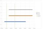
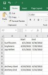
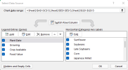
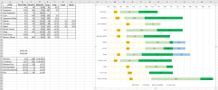
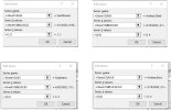
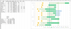
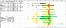
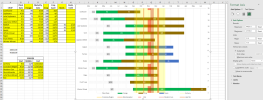
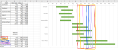
So I'm spending way too much time on this, but I'd like to create a spreadsheet/chart that will visually display several aspects of my planting plan on a chart. So far I've got the stacked bar chart showing the plant/germination dates in a suitable format. (my newest version looks even better than the image below) Now I'd like to further mimic another chart I've seen elsewhere, by drawing perimeter or shaded boxes around some time frames for various seasons or events. See my hand drawing of the boxes below for some examples. I've experimented with combo charts and other methods, but have not found anything that will work just yet.
I know I could skip the chart function and just manually format and shade some cell ranges to get a similar effect, but I'm determined to do it with the chart function if at all possible. Any Excel experts out there that could point me in the right direction? Once this is figured out, I'm also planning to add my Gen5 gate and clutch settings, and #'s per acres into the spreadsheet. I'll happily share my results if I end up creating anything worthwhile.
Thanks, Steve.
Thanks, Steve.
I know I could skip the chart function and just manually format and shade some cell ranges to get a similar effect, but I'm determined to do it with the chart function if at all possible. Any Excel experts out there that could point me in the right direction? Once this is figured out, I'm also planning to add my Gen5 gate and clutch settings, and #'s per acres into the spreadsheet. I'll happily share my results if I end up creating anything worthwhile.
Thanks, Steve.

Thanks, Steve.

